Creating and Building Your Brand
Building your business into a recognized brand can be a long, daunting, and arduous process. Sometimes, you’ll need to deconstruct what you already have in order to redesign it better. There will be many areas of your corporate branding that do not conform to anything else that you have. Your company stationery may have your logo on, but may not use the same fonts as your brochure, which may not use the same colors as your advertising, which have completely different imagery to your website.
To create a great, consistent, and recognizable brand, all of these items need to be unified into a single style methodology, so that all of the elements that make up your corporate identity work together as a whole to present your company as confident, reliable, and professional.
Here are some of the elements that go towards creating a brand, and how to work with them. We’ve deliberately kept it simple so as to be easily digestible, and we’ll expand on each area in future posts:
Logos
Your company logo should be representative of who you are and what you do, yet should be simple and easily recognizable. Try keeping to just a few colors; ideally these colors will be at least some of the ones that you use for the rest of your corporate branding color schemes. Font choice is also important, since if you use a font that is too complex, has very fine serifs, or is difficult to read, it can make it hard to discern at small sizes, on computer screens, or on phone screens.
Brand Colors
As we mentioned above, your company colors should be derivative of your logo, or compliment your logo colors sufficiently enough to justify using a different color. Your color schemes can to a large degree vary with your field of expertise or industry. For instance, the hospitality, toys & games, or vacation sectors are safe to use bright, attractive, cheerful colors, which you probably wouldn’t want to do if you were a law firm or a funeral home.
Fonts
We mentioned fonts above, under logos. Te same is true for any font that you use. It should be clear, easy to read at any size, on any screen, and should be stylish enough to create a crisp, modern feel. You can have the best designed logo and color scheme in the world, but if your fonts don’t look contemporary to your design or are illegible, they’re not worth a thing.
And if you only ever use Arial, Times, Verdana, or Tahoma, then you are in a good place, especially online.
Images
Try and use your own imagery whenever possible. There is some good stock photography out there, but you sometimes have to pay through the nose for it, unless you want to look the same as anyone else.
Design Elements
Design elements is a very wide heading to describe design features other than your logo, colors, images, and fonts, such as secondary graphics, icons, illustrations, and so on, that have been put together specifically for your purposes. And as we said above, your design elements should maintain the color scheme that has been established by your logo and brand colors, and should use the same fonts too.
Brand Messaging
This is all about who you are, what you do, what you sell, and how you attract, service, and support your customers. Your messaging should be descriptive, yet concise. There’s no need for padding and overly-long descriptions; just describe who you are and what you do in a short and simple manner.
Of course, when it comes to marketing collateral and your website, you can then go deeper and expand upon your concepts, products, services etc., which is where people will be looking for that extra detail.
Advertising and Marketing
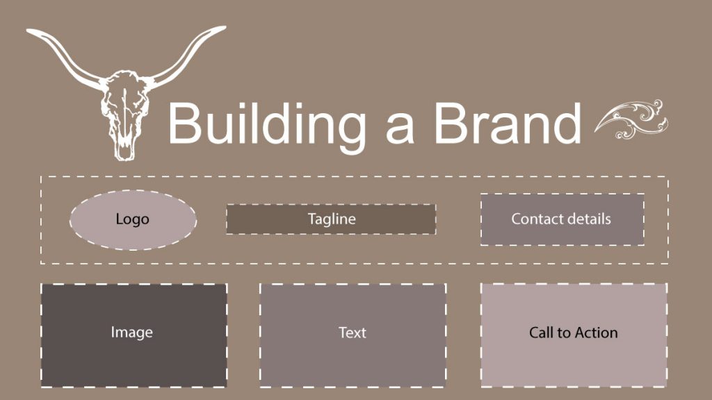
This leads on directly from Brand Messaging. Expand on your messaging in your ads and marketing campaigns by making the focus of the ad a particular promotion, service, product, event, or other detail relevant to your company. Make sure your contact details are clear, but not as prominent as the product being advertised, and that you have a clear ‘call to action’ for the reader to follow, such as ‘Find Out More’ or ‘Request More Info’, then add in your contact info after that.
Collateral
Comprising your brochures, flyers, leaflets, etc., your marketing collateral should also follow all of the guidelines laid down in the previous sections. Something else to consider with collateral design is to try and keep some consistency with the size, colors, and positions of your headers, footers, logos, and other graphics, so that all of your collateral material looks like it comes from the same family. And of course, it should display the same messaging principles as your adverting, marketing and other related pieces.
And remember to prominently include calls-to-action and your contact information.
In Conclusion
Going back to the first paragraph, building a brand is not a quick or simple process, but it is vital to your business. Your customers want to see a unified corporate identity. The visual queue that it portrays helps them feel safe, builds trust, and let’s them know that they’re dealing with the same, reliable company, and keeps them coming back.
Gleneden Ridge Design is happy to assist and advise anyone who needs help with the corporate image. If there’s a particular area that you may be struggling with, then get in touch and we’ll help you move forward, and build a better brand.
And don’t forget to find us on Facebook, LinkedIn and Twitter!