Following on from our previous ‘Brand Styling Overview‘ post, today we’ll be discussing colors, in particular, color wheels, a bit of color theory, and how to create a balanced pallet of complimentary colors for your brand.
Color is vital to your image. It underlies and involves everything that you do to present yourself. Its in your logo, your fonts, your graphic elements, brochures, websites, etc. Color can present cheerfulness and depression, movement and stillness, darkness and light, so its important to choose the right color pallet to help portray your company how you see it.
Color Terminology
To start with, here are a few technical terms that you may have come across:
- Hue: the actual color of an object; red, green, blue, etc.
- Chroma: this is the ‘purity’ of a color, i.e. a hue with low chroma contains large amounts of black, white, or grey, whereas a high-chroma hue has none.
- Saturation: basically, the intensity of the color, so for instance, whether a particular red looks light or dark according to prevailing lighting conditions.
- Value: a number that represents the lightness of a color in relation to others, so black has the lowest value of all colors and white has the highest.
- Tones: you get a tone whenever you add grey to any hue, creating a soft, dull version of the pure hue.
- Shades: a hue is turned into a shade whenever you add black to it, darkening the pure hue considerably and creating a neutral color.
- Tints: you make a tint by adding white to a pure hue, create a light, feminine color, often called a pastel color.
Color Pallets
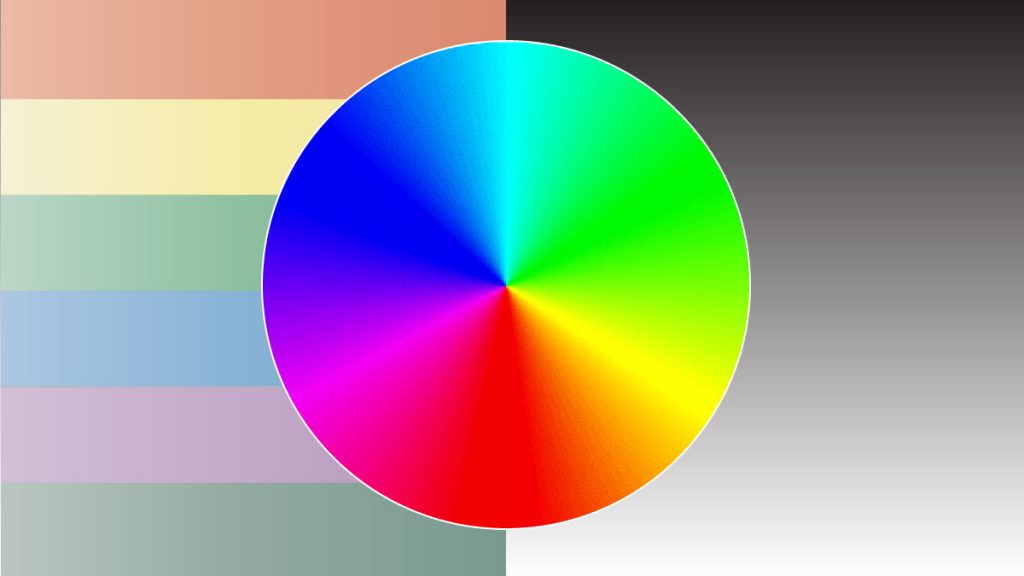
Now that we have some basics down, lets look at the color wheel. Below is a basic 12-spoke color wheel. This is a vital piece of your color puzzle as you can use it to create various types of color pallet:
Color pallets fall under a range of different categories as follows:
- Analogous: this type of pallet is made up from three hues that are next to each other on the above color wheel. they can contain tints, tones, and shades from within each hue.
- Monochromatic: these are made up of tints, tones, and shades of the same hue.
- Complementary: made of from two hues that are directly opposite each other on the above color wheel. they can contain tints, tones, and shades.
- Split Complementary: more complex that a standard complementary pallet, a split-complementary uses one base hue, then the two hues adjacent to the opposite hue.
- Triadic: tricky to create but can be very successful when done properly, a triadic pallet uses three hues equally-spaced around the color wheel, and can contain tones, tints, and shades.
- Tetradic: another type of pallet that is difficult to create, a tetradic scheme uses five colors from around the wheel to create a complex pallet of hues, tints, tones, and shades.
- Custom: the hardest of all to successfully create, the custom pallet uses no rules except for those that you impose yourself. You need to be careful to balance all hues, tones, tints, and shades so as not to create a pallet that clashes.
Creating Your Color Pallet: things to keep in mind
You can use whichever type of color pallet that you like, but keep it simple to start with. You can begin by using a monochromatic pallet with a few tints and shades, then add in a couple of analogous colors or a complementary color to add interest and contrast.
One thing to bear in mind is your area of industry. As we mentioned previously, try and keep your color scheme relevant to your business sector. For instance, toy stores tend to go towards brighter, cheery primary colors to attract kids and parents: red, yellows, blues, whereas lawyer firms and funeral homes will have a tendency towards more professional, sombre colors: deep reds, browns, dark greens and greys.
If you have an existing logo, try using the main color in the logo as your primary color, then add additional colors, tones, tints, and shades to create a pallet keyed to your logo.
Don’t forget about your tints, tones, and shades to add diversity to your chosen hues; these can add depth, mood, and variety to your pallet, whilst keeping it balanced and consistent.
And make sure to add in some neutrals for additional flexibility. Blacks and greys add visual interest. Tans and browns can be a little trickier to work with but create warmth and add balance to your pallet.
Here are some examples to get you started, based upon the color wheel above:
Next time, we’ll talk about how to convert these colors to web-standard colors for online use, and to Pantone or CMYK colors for print production.
For more information on color schemes and building your brand, contact Gleneden Ridge Design.
